Woodland & Forest Photography

WEEKLY NEWSLETTER

Bringing the Beauty of Woodlands and Forests to Life
March 4, 2024
WEEKLY NEWSLETTER
Dear Photography Enthusiasts,
Welcome to my weekly newsletter that helps you take your photography skills to the next level. In this issue, I will explore how to Use White Balance, Color Temperature, and Color Wheel to Get the Correct Colors. Whether you are a beginner or a seasoned pro, this knowledge will help you capture stunning photos in any situation.
This week topics

How to Use White Balance, Color Temperature, and Color Wheel to Get the Correct Colors
White balance is one of the most important camera settings that can affect the look and feel of your photos. It determines how warm or cool the overall colors in your image are, by setting a "neutral" (or white) point from which all colors are determined. Different sources of light have different color temperatures, measured in degrees Kelvin. In woodland and forest photography, you may encounter various lighting situations that can challenge your white balance skills and affect the accuracy of your colors.
In this newsletter, I'll show you how to use white balance both correctively, so that your images aren't too warm (orange) or blue (cold), and creatively, when you want to create an image with tones different than what the human eye is seeing. I'll also give you some tips and tricks on how to use the color wheel to enhance your color choices and create stunning effects in woodland and forest photography.
How to Use White Balance Correctively:
The first step to using white balance correctly is to understand what it is and how it works. Your camera is pretty good at reproducing color because it has the ability to analyze the scene and compensate for overly warm or cool colors. Usually, colors in your photos will look pretty close to the way they looked in real life. However, your camera is easily confused and can sometimes make the colors too warm or too cool. This is called a "color cast", and it happens because the color of the light source varies.
To fix this problem, you can use your camera's white balance settings, which are usually located somewhere in the basic options of the menu. Your camera has several options for white balance, such as Auto, Daylight, Cloudy, Shade, etc. The most common one is Auto, which actually works pretty well most of the time. In auto white balance mode, your camera examines the scene you're trying to photograph and chooses a color temperature (in Kelvin) it thinks will work best.
However, your camera can easily get confused if the scene doesn't contain any colors which are white, or close to white. In that case, you may want to manually set your white balance using one of the other options. For example, if you're shooting under fluorescent light or in heavy shade, you may want to use Shade or Custom White Balance respectively. By using these options, you can override your camera's automatic decision and adjust the color temperature yourself. The photographer I'm introducing in this newsletter has been a great inspiration to my woodland and forest photography. His moody forest images is awesome, well, that's of course personal, but for me, his way of using color, light, and shades fits my own way of looking at the forest atmosphere, and the feeling that gives me. His tutorials in using Photoshop has been a great help for me beginning to understand how to use it.
How to Use White Balance Creatively:
The second step to using white balance creatively is to understand what color temperature is and how it affects your images. Color temperature is measured in degrees Kelvin. Different sources of light have different color temperatures. Incandescent or tungsten lights are warm. Candlelight is even warmer. The natural light on a cloudy day is cooler, while fluorescent light can give your photo a green cast.
By understanding color temperature and how it affects your images, you can use it as a tool to create different moods and effects in woodland and forest photography. For example, you can use warmer tones (such as sunset or candlelight) to create a cozy and inviting atmosphere, or cooler tones (such as overcast or blue sky) to create a serene and tranquil atmosphere. You can also use color temperature creatively to emphasize certain elements or contrast them with others.
Understanding the Color Wheel:
The color wheel is a visual representation of the relationships between colors. It helps us see how colors relate to each other and how they can be combined harmoniously. The most common color wheel used by painters is based on the RYB color system:
Primary colors:
Red, yellow, and blue.
Secondary colors:
Mix two primary colors to get orange, green, and violet. Tertiary colors:
Combine a primary color with a neighboring secondary color (e.g., red-orange, yellow-green, etc.).
Using the Color Wheel in Photography:
Monochromatic Colors:
A monochromatic color scheme uses variations of a single color. You can create different shades by adding white (tints), black (shades), or gray (tones) to the base color. Monochromatic palettes create harmony and consistency in your composition.
Example: Using a color-toned monochromatic palette to unify various elements.
Complementary Colors:
Complementary colors are opposite each other on the color wheel. Using complementary colors in your composition creates strong contrast and impact.
Example: Pairing red with green or blue with orange.
Analogous Colors:
Analogous colors are adjacent to each other on the color wheel. They create a harmonious and soothing effect.
Example: Combining shades of blue and green or yellow and orange.
Triadic Colors:
Triadic color schemes use three equally spaced colors on the wheel. They provide balance and vibrancy.
Example: Red, yellow, and blue.
Split-Complementary Colors:
Choose one base color and then use the two colors adjacent to its complementary color. This scheme offers contrast without being as intense as complementary colors.
Example: Pairing blue with yellow-orange and red-orange.
Experiment and Observe:
Use the color wheel to plan your compositions.
Pay attention to how different color combinations affect the mood and impact of your photos. Remember that color can evoke emotions and convey messages. Remember that color is a powerful tool in photography. Whether you’re capturing vibrant landscapes, portraits, or still life, understanding the color wheel will enhance your creative choices and help you create visually compelling images.
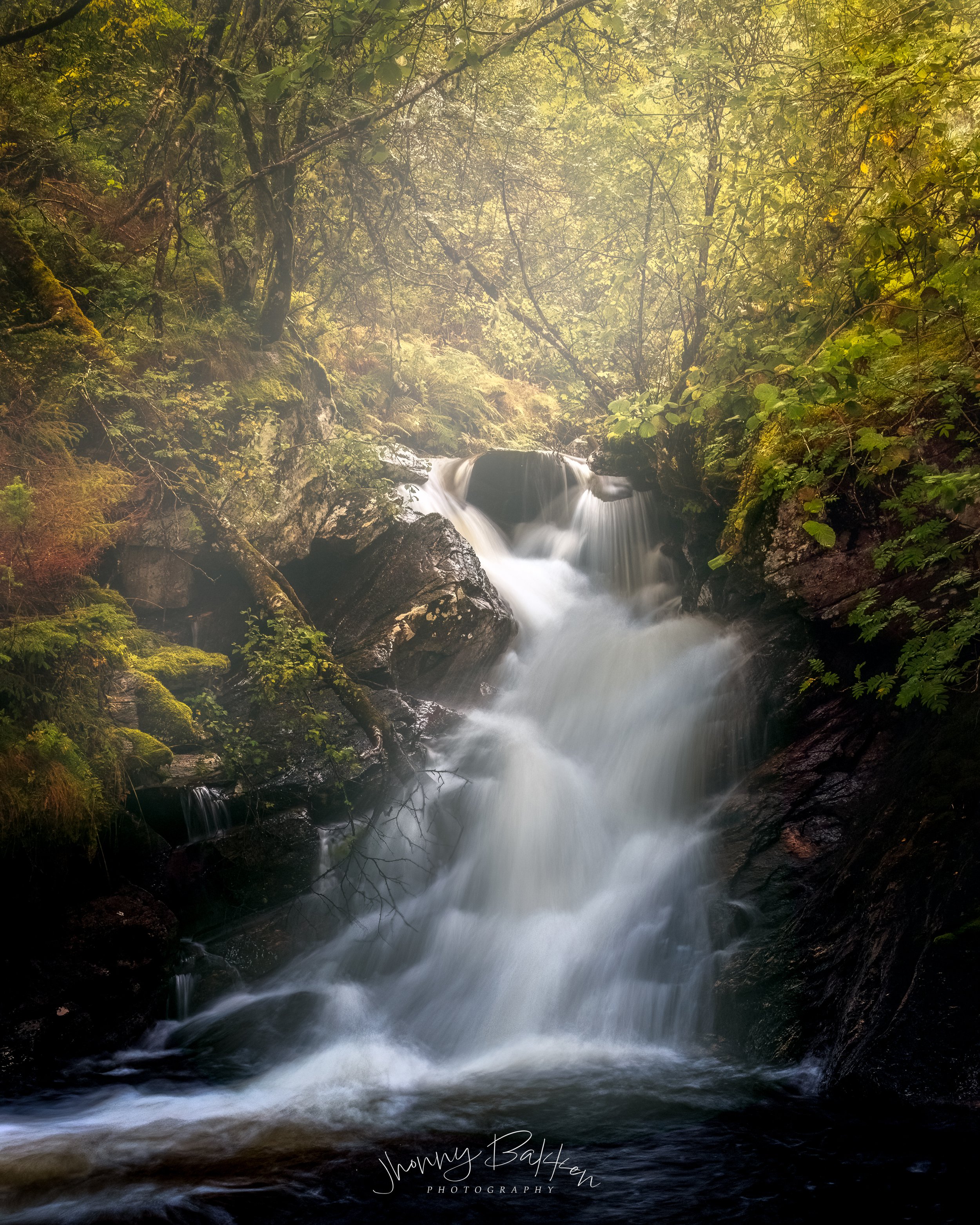
Inspiration of the week

Image: Nick Page Photography
Introduction:
Nick Page is not just a Landscape Photographer, he is a storyteller who captures the beauty and mystery of nature. From a small town in South Eastern Washington state, he has traveled the world to find the most stunning scenes of forests, mountains, and oceans. His forest images are especially captivating, as they evoke a sense of wonder and awe. He is well-known for his breathtaking seascapes, but his landscapes and woodlands are equally impressive. He has a remarkable talent for working with light and atmosphere, creating images that are both realistic and artistic. I discovered him through my online searches for moody woodland and forest, and I was instantly hooked by his vision.
YouTube Channel:
I started following him on YouTube, where he shares his adventures and tips. He is not only a great photographer, but also a great person. He cares deeply about nature and its preservation. He follows a simple but powerful philosophy: “leave it better”. He always tries to clean up any trash he finds and encourages others to do the same. He believes that we have a responsibility to protect and respect the environment. He is also a generous and charismatic teacher, who shares his skills and knowledge with others.
Photoshop Skills:
He is an expert in Photoshop, and he shows how to enhance and edit images without losing their authenticity. He has a remarkable talent for working with light and atmosphere, creating images that are both realistic and artistic. He teaches how to use various tools and techniques to achieve the desired effects, such as color grading, dodging and burning, blending modes, and masking. He also explains the concepts and principles behind his workflow, such as composition, exposure, contrast, and mood.
Conclusion:
If you are looking for inspiration in any of these genres, you should definitely check out his work. You can find the link here. He is a storyteller who captures the beauty and mystery of nature. He is a great photographer, a great person, and a great teacher. He is Nick Page
Challenges

To test your skills and creativity with white balance in woodland and forest photography, I've created a challenge for you. The challenge consists of three scenarios: A) Shooting under fluorescent light; B) Shooting in heavy shade; C) Shooting under candlelight. For each scenario, I've provided a sample photo taken with different white balance settings (Auto, Daylight, Cloudy, Shade). You can see them below.


Can you identify which white balance setting was used for each photo? Can you also explain why I chose that setting? How does it affect the look and feel of the image? Take a look at them and let me know what you think!
I hope you enjoyed this issue of the Woodland & Forest Photography Newsletter, and that you found inspiration learned something new and useful for your own photography. I would love to see your woodland and forest images, so please feel free to share them with me on my social media channels. Remember, every picture has a tale, and each tale can motivate and charm. Let's collaborate to keep spreading the amazing marvels of nature with the world.
Until next time, happy shooting. If you have any questions, comments, or feedback, please feel free to contact us.
PS: What’s the #1 thing that made you want to check out my newsletter? Reply and let me know. I read every reply.
Sincerely,
Jhonny Bakken
Founder, Woodland & Forest Photography
Woodland & Forest Photography,
Nygjerdet 14, 6030 Langevåg
Møre og Romsdal
NORWAY